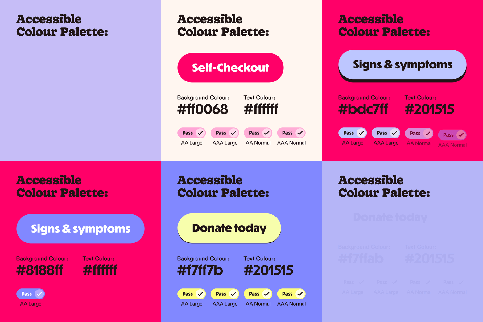
The CoppaFeel! identity stems from the concept of ‘urgent/squish’, the brands ultimate mission being to deliver the urgent message of getting people to check themselves for breast cancer. Our aim was to craft an identity that acts as an immediate reminder for audiences to self-check. Through a distinctive, tactile, squishy logo, we sought to imbue the branding with the spirit of CoppaFeel!, effectively conveying its message through a visual metaphor, that feels both unique and unmistakably associated with breast cancer awareness.
COPPAFEEL! BRAND REFRESH · LIVITY
The type-system also works two-fold: using Gooper to represent the bodily element and Dunbar for more urgent statements: whilst representing CoppaFeel! in a bold new, editorial light. We also produced a photoshoot for the charity for an always-on bank of fun, fresh images.
Livity Brand & Research Team
Lucy Harmony Grimes
Fiona Ghobrial
Rachael Kendrick
Emily Hang
Alex Goat
Gorgia Brewer
Sheyi Ogunshakin
Logotype by Tina Smith
Icons by Jordan @ Studio Anti-Gravity
Photography Production Credits
Photographer:
Naomi Wong
Creative Director:
Jane McFarlane
Website & web assets
Milk & Tweed


