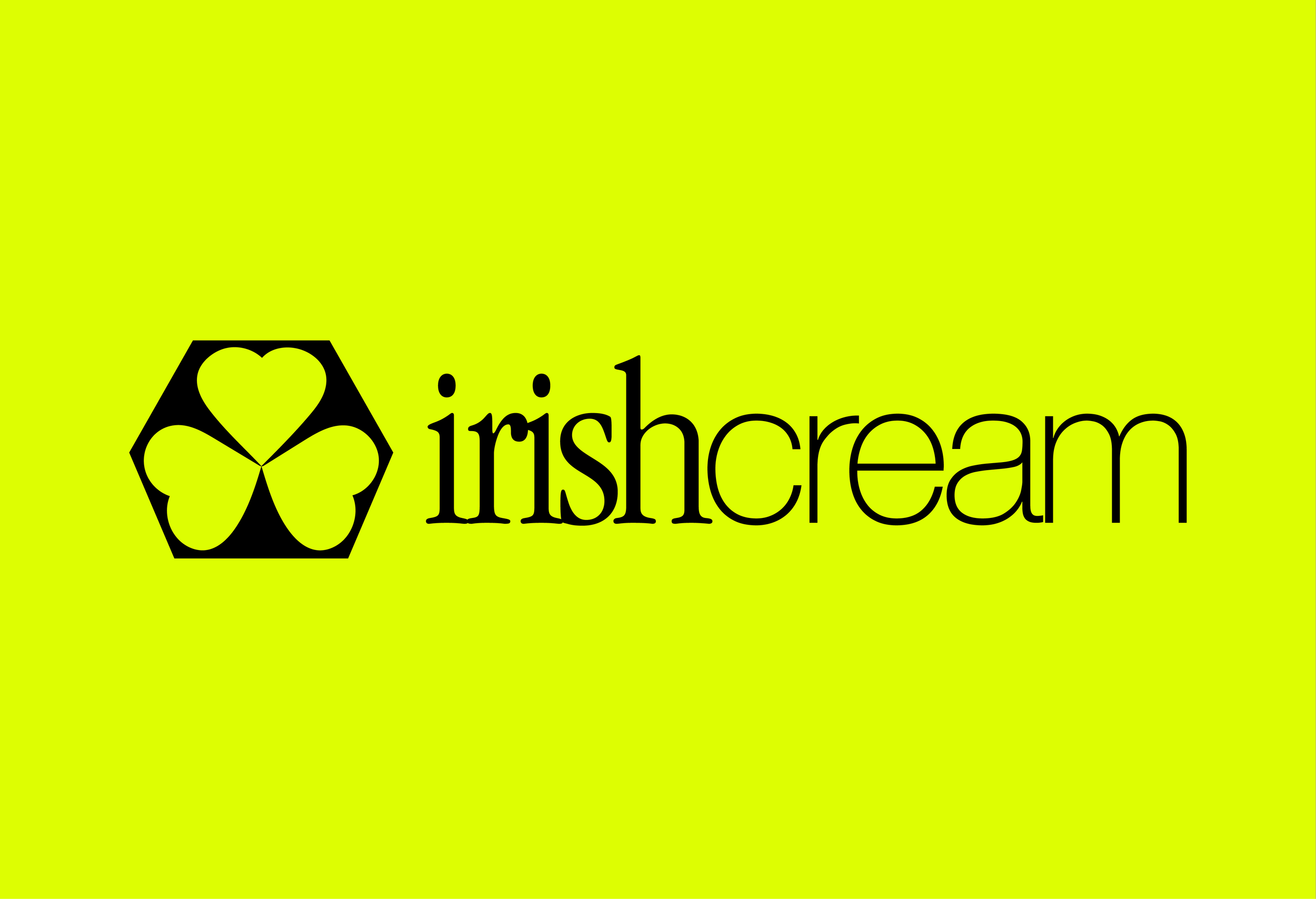
Playing into the physicality of the ‘object’ in a general sense – I created a unique mark with edges, an abstract shape which generalises the products sourced in the shop. A shape which could be the top of a table, or the edges of a handmade candle, and ultimately a symbol that represents Irish Cream for what it is, a store selling beautiful objects.
The hard edges of the outer shape are opposed by a shape that nods to a shamrock, a more feminine, delicate element that refers to the owners’ Irish heritage & of course the name of the shop – which was important to the client in this project.
IRISH CREAM BRAND IDENTITY
PROCESS


