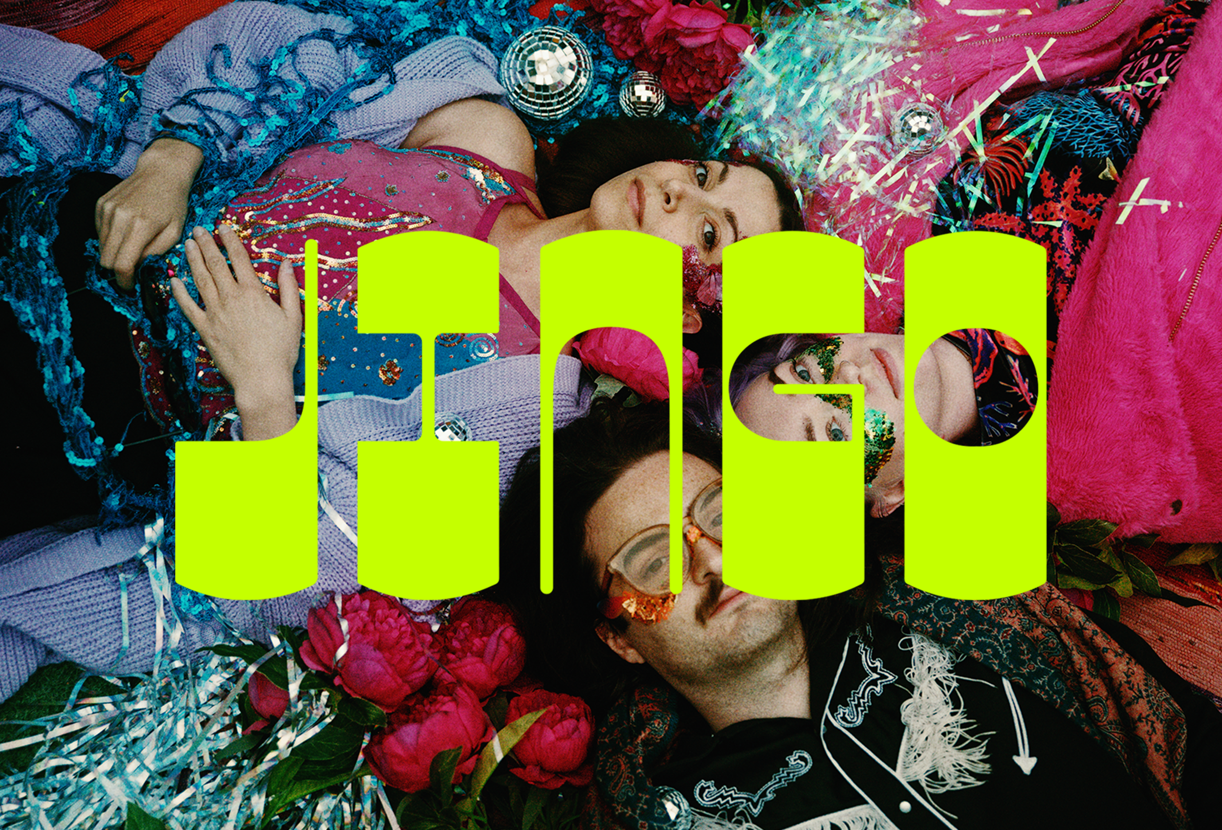
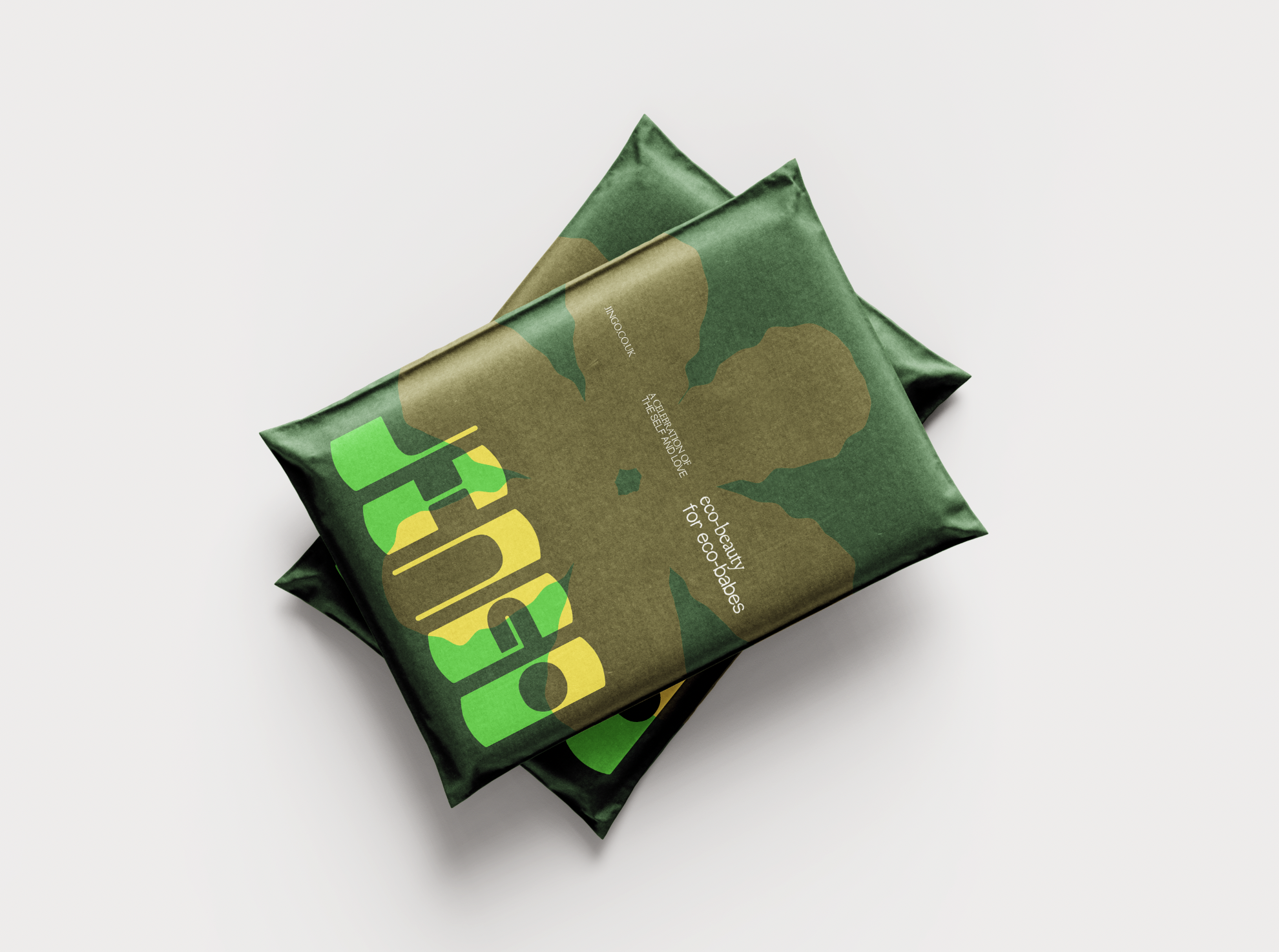
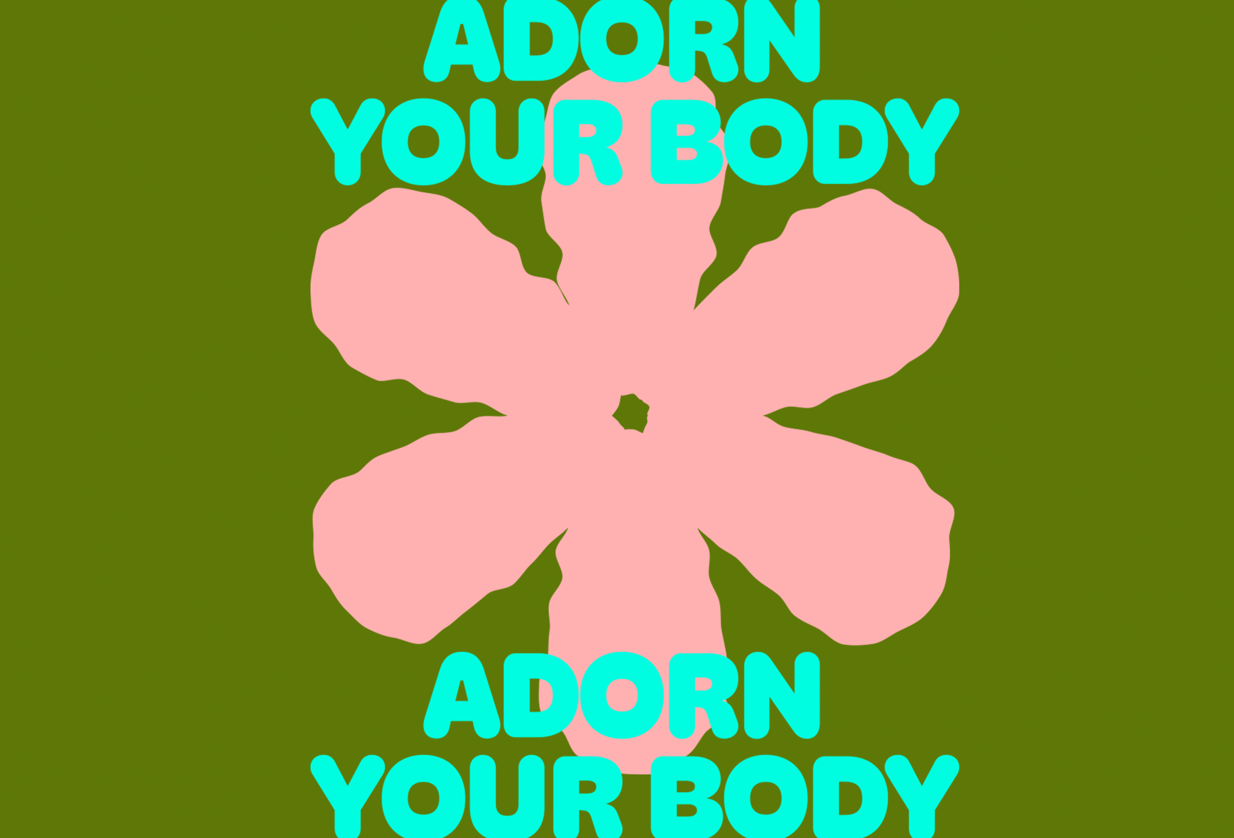
Steering away from the squeaky-clean, millennial-pink cosmetic branding aesthetic, I created a gender-neutral identity that is brash and almost clunky, creating a space which feels reflective of the festival atmosphere - like a warm and happy summer day: whilst also working to cut through the noise of the cosmetics market. The wordmark is striking yet free-spirited: playing into festival/carnival culture. There was an emphasis on sustainability so the typographic system nods toward an organic aesthetic. The identity is purposefully flexible, leaving space for the brand to eventually grow & expand, through packaging and activation signage.
JINGO BRAND IDENTITY
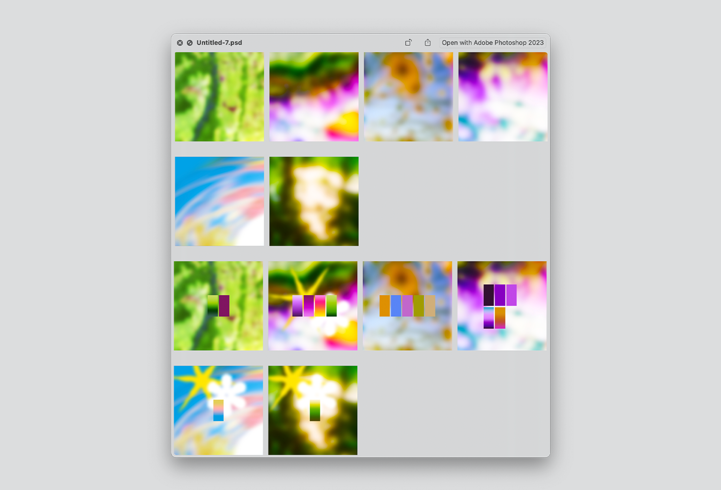
PROCESS / ICON


